Brief
Habi El Qods is a jewelry store with multiple sales points. They were in the business since 1980, known for their work quality and variety. With their excellent service, they had clients from all around the country, but their visual identity was not ready. At the time, the logo and branding materials didn't reflect the core values of the business or the future their plans — my brief was to give the brand a refresh so they can scale.
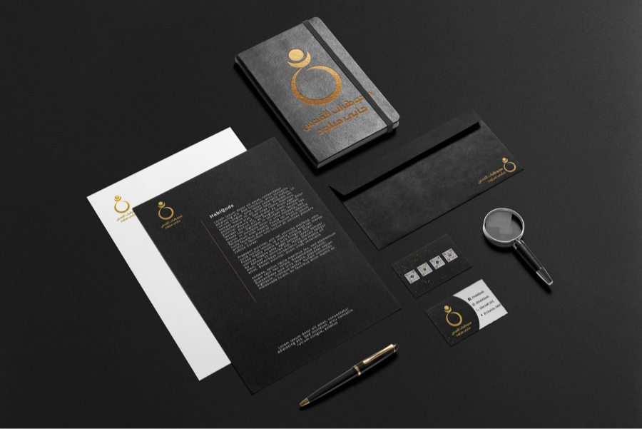
Next, I will talk about the logo and business card design.
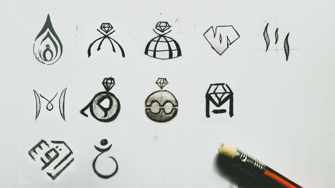
Vectorization
We chose two concepts to vectorize them and see how they will look like after realization.
Next meeting, we decided which one to go with. Then, we reviewed the colors and typography preferences.
Results
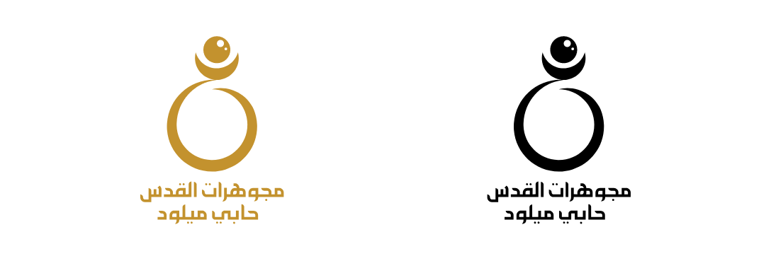
Variations :
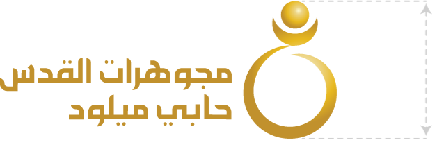
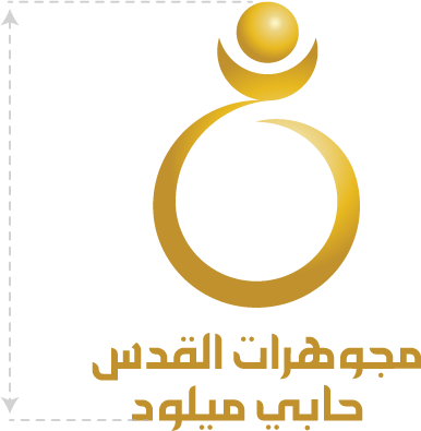
Depending on where it’s used, the logo variant will change. There are two variants. The logo should be sized for clear legibility with a minimum width of 20mm for the horizontal variant and 10mm for the vertical variant.
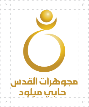
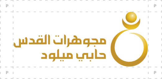
Preservation area :
Moujawharat ElQods Habi Miloud logo is framed with a protection
zone ensuring a good visibility and a direct identification. This
protection zone is an invisible rectangle devoid of content.
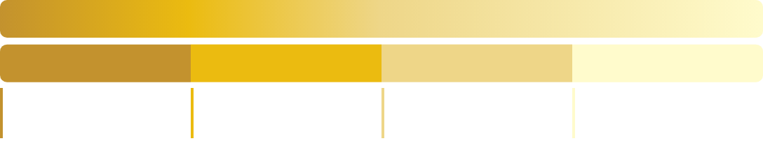
Colours :
This logo use a gradient composed of 4 colors to achieve the gold effect. The text under the logo uses the darkest shade.
Usage guides :
- The logo is used with a black or white background ONLY
- A SOLID COLOR is used for the smaller versions. (black or darkest shade)
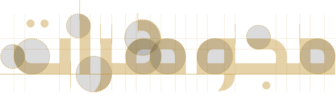
Typography :
The used typography is a corrected clone AlreoyaNetLight. sharp edges, bold typography, and modernity are its main characteristics.
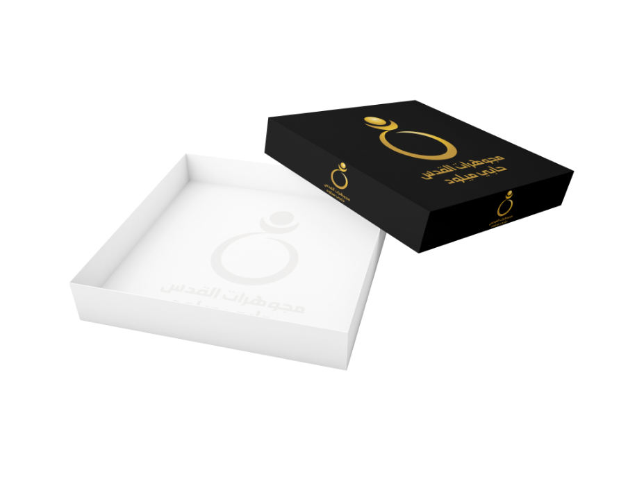

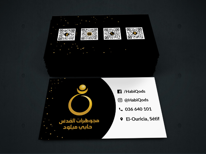
Business card design
In our meeting, I asked the stakeholders about the problems that they can see with the actual business card design. Next, we discussed what content they want to add/remove, and I was able to start working.
Copyright © 2019 Abderezak KAFI