Brief
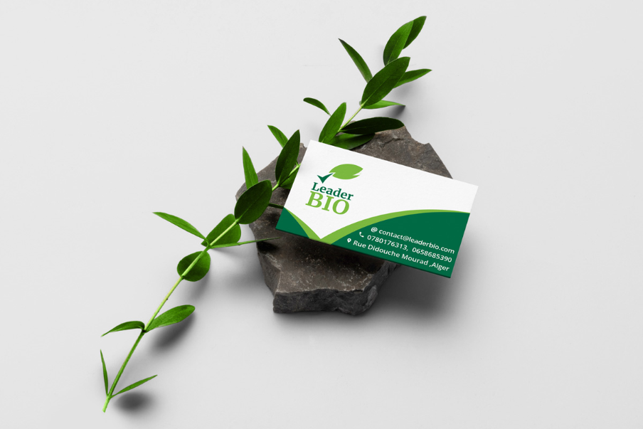
Leader BIO is an enterprise who produces bio food locally. It aims to satisfy the needs and be the leader of the market. Starting with oatmeals and Spelt Flour all the way to biscuits and rusks, Leader Bio encourages a healthy lifestyle and wants to present this value in their brand. My role was to help them to define their branding strategy then we moved to the realization of the different parts.
Ideation
Brand attributes

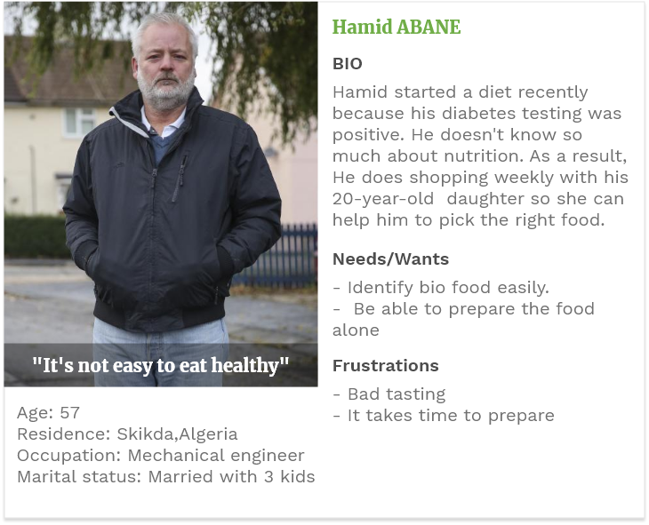
User profiles

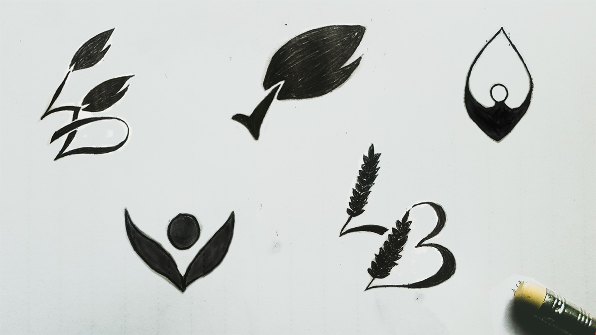
Sketching
Realization
Colours
There are two colors used in this logo: Dark Green is used for the trust symbole and Leader word. Light green is used for the Leaf and BIO . Weak black is used for the signature.

Variations
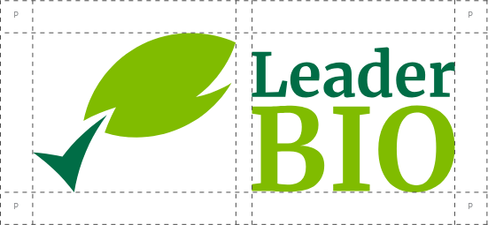
Depending on where it’s used, the variant of the logo will change. There are two variants. The logo should be sized for clear legibility with a minimum width of 20mm for the horizontal variant and 13mm for the vertical variant.
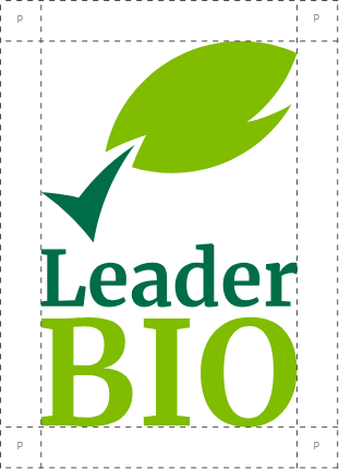
Preservation area
The Leader BIO logo is framed with a protection zone ensuring a good visibility and a direct identification. This protection zone is an invisible rectangle devoid of content.
Usage guides
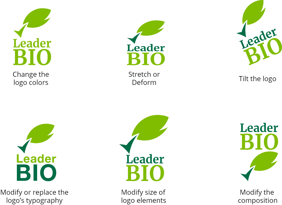
DO NOT
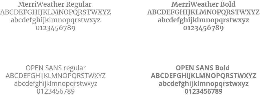
Typography
The typography of Leader BIO is Merriweather. It is used for the sake of maximum readability. For any text following the logo, Open Sans typography will be used to facilitate reading on websites and on any support documentation.
Applications


See also
Copyright © 2019 Abderezak KAFI